It’s been almost a year since my last post on painting miniature figures. Therefore, I’m going to review the style of mini painting I use before I show lots of photos. I’ll begin with why I started painting minis again.
Etherfields
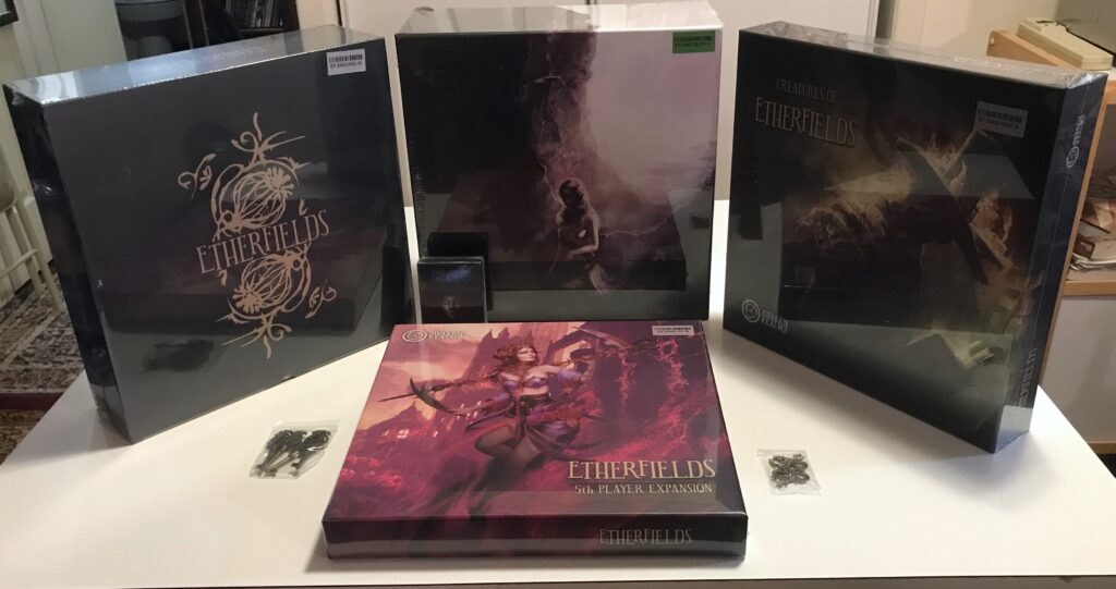
Etherfields is a board game that I backed on Kickstarter. After a wait of about 1.5 years, the first wave of boxes arrived at my door a month ago:
The game setting: You and any other players (the game can be played solo) find yourselves in a world of dream. At the start of the game, you do not know who you are when you’re awake, or what your purpose is in this world. Etherfields is a game of exploration and discovery, as you travel through a dreamscape to learn what’s going on. Much of the game, including the rules, are unknown to you at the start. Game-play is cooperative. It includes puzzles and challenges that involve clues in the artwork on the cards. The story of the game evolves based on the choices you make. There is combat, but that’s not the main focus of the story.
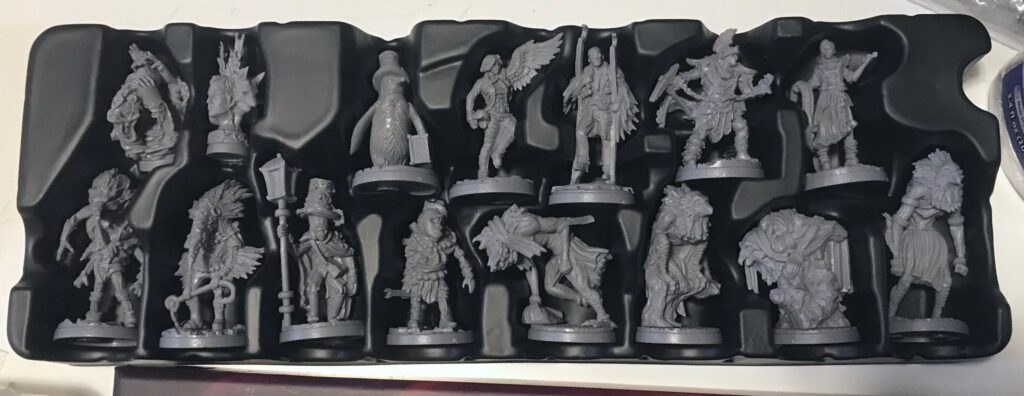
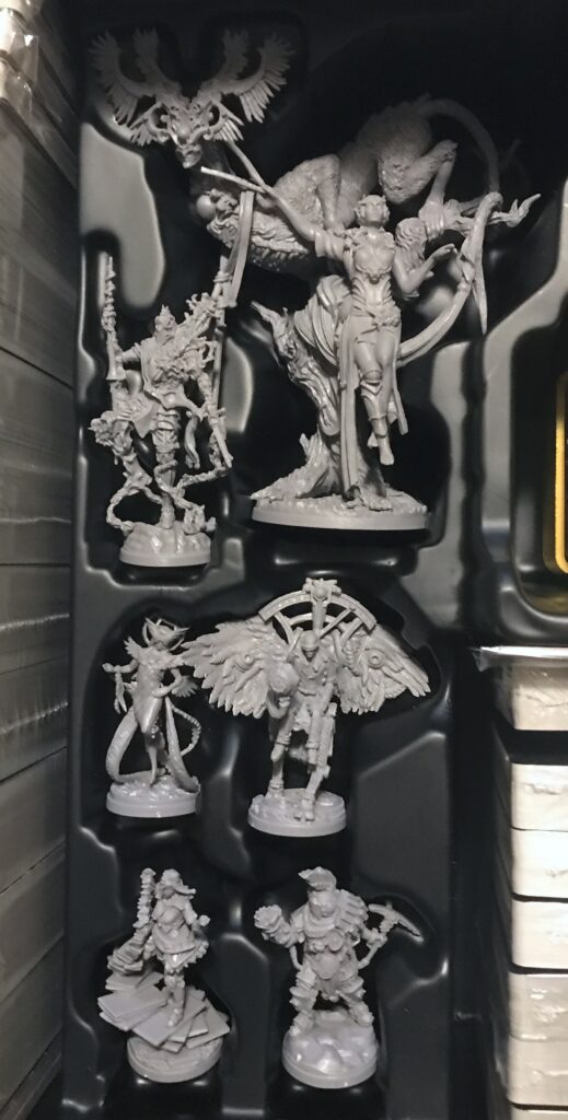
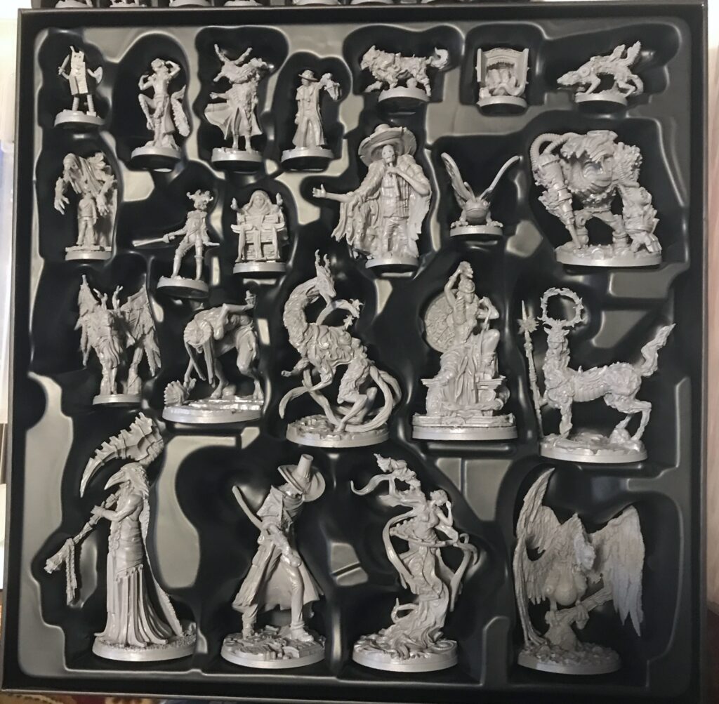
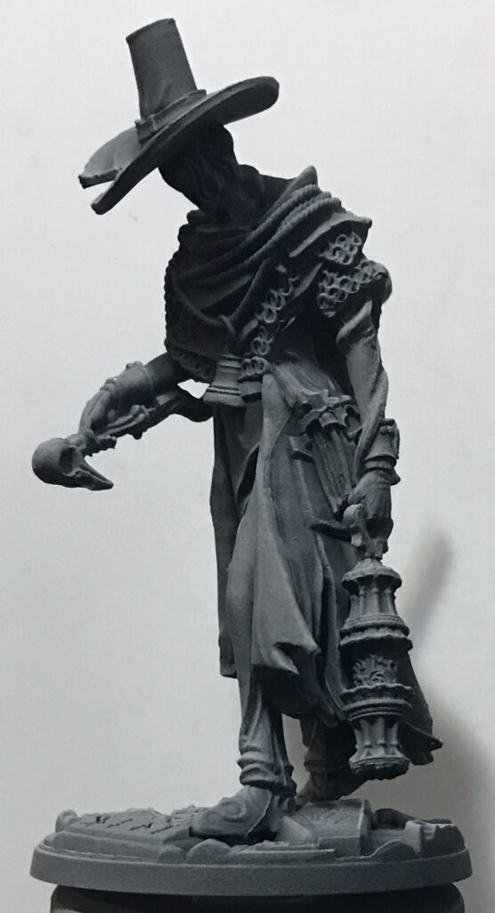
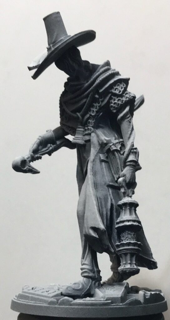
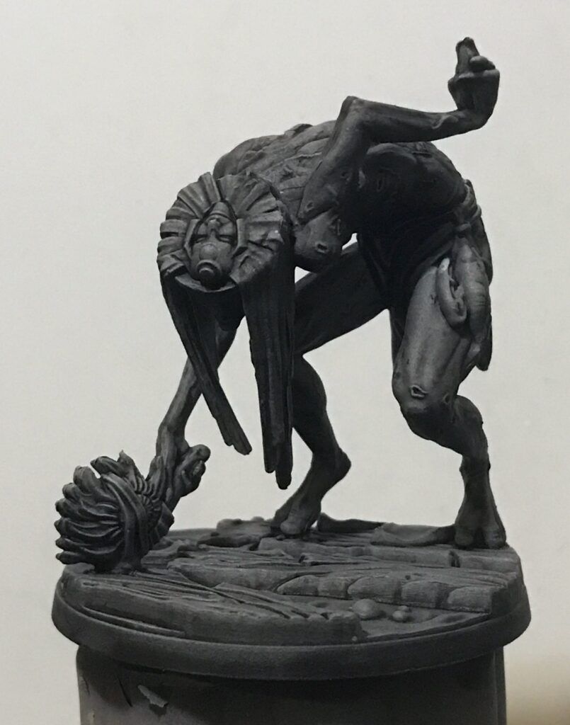
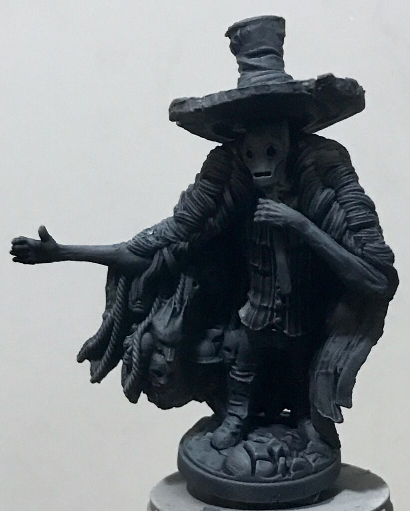
One of the selling points of the game for me are its miniature figures:
After my burst of minature-figure painting about a year ago, I let that hobby slide. For example, my Icaion figures remain unpainted. The main reason I didn’t feel like painting those figures is that I got the impression from my general circle of gamers that they weren’t interested in playing the mini-containing games that I had, even after the pandemic was over. (The exception is Gloomhaven: Jaws of the Lion, but I have a feeling I’ll be giving that game away after I’ve played it with my friends.)
But with the Etherfields minis… I mean, just look at them! They’re screaming to be painted! It’s time to get out my airbrush.
Choices
I knew I didn’t have the skill, energy, or health to do the detailed painting I’d done for Mysthea. Instead I went with the the style I’ve described before: apply zenithal priming, then a wash or contrast paint. I looked over the miniatures I painted for Tainted Grail:
When I assessed those minis, I found that I was unhappiest with two categories of the results:
- When I’d gotten “clever.” The worst offender is the Wyrdbear in the lower right-hand corner of the above picture. In general, the further I deviated from my simple technique the less I liked the results.
- When the colors were too intense. The pale or pastel colors suited the “sketch” or “Sundrop” style better. The more intense colors of the Citadel Contrast Paints, designed by Citadel to be applied to segments of the minis, were not really suited for simple pre-shading.
For the the first point, all I had to do was exercise a bit of restraint. I made a couple of exceptions, as you’ll see below… and once again, in one case at least I was not satisfied with the result. I’ll let you decide which one that was.
As to the second point, I diluted the more intense paints with medium. You’ll see the results below.
Paints
A little bit of chronological math will tell you that I left my paints sitting in a closet for most of a year. As you might guess, many of them had separated.
Fortunately, I’d seen a video by Vince Ventrella that gave me a simple answer:
This is what I got:
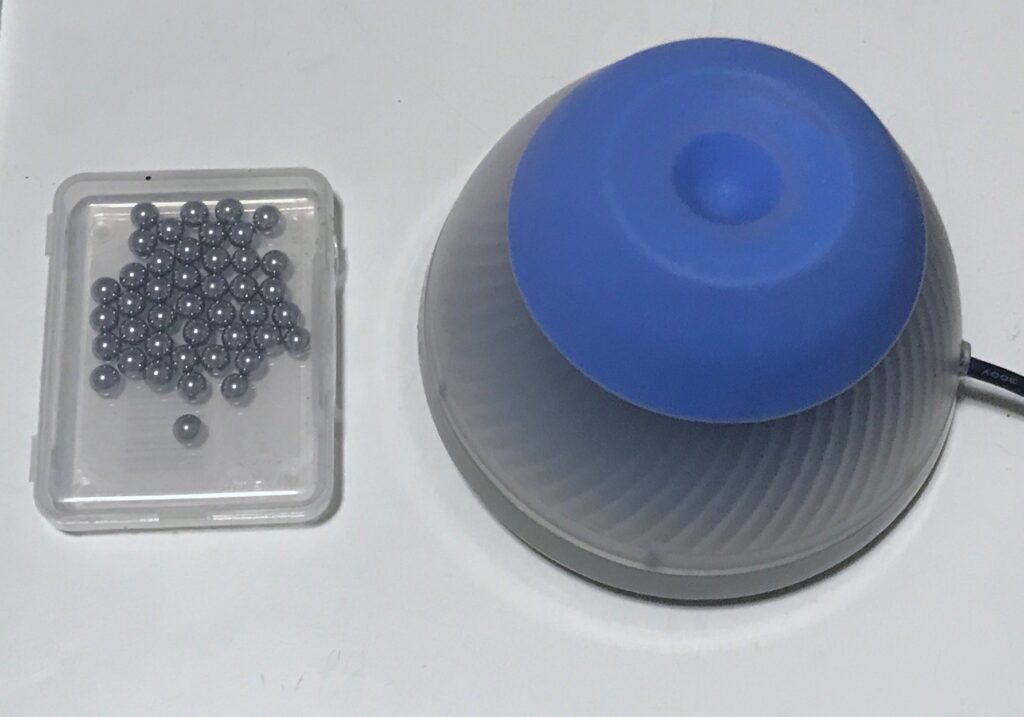
As I opened each new container, I dropped an agitator ball inside. I then held the container on top of the mixer for a few seconds (sometimes longer for thick paints). It spared me endless amounts of shaking and uncertainty, especially for those containers whose insides I could not see.
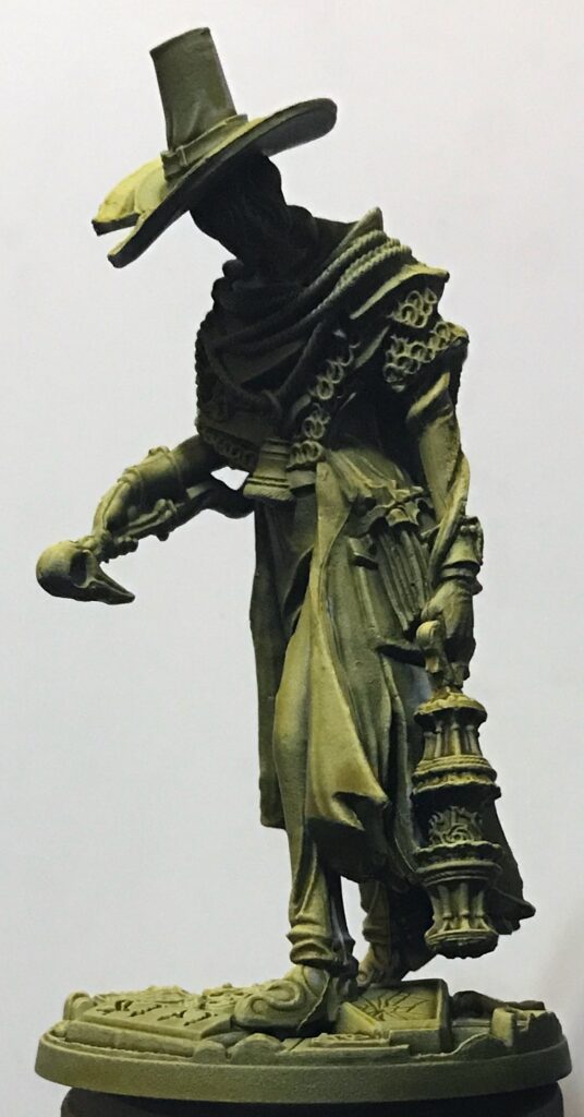
Zenithal primes
… or should that be “zenithals prime”?
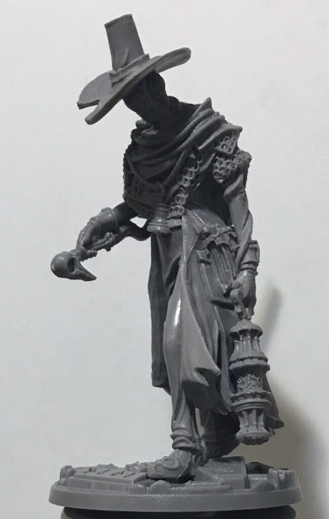
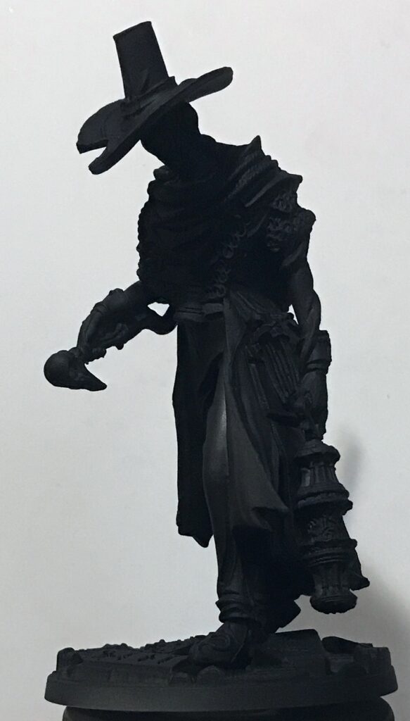
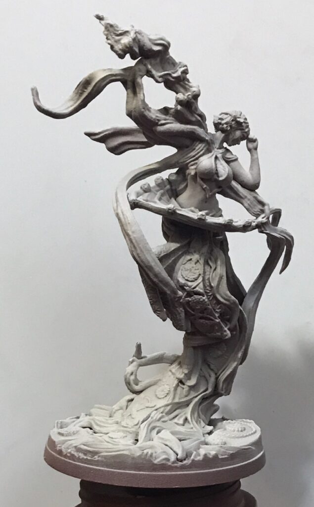
This is a reminder of the technique I used for the undershading of the colored paints. For zenithal priming, first I airbrushed the entire mini with a dark color. Then I applied an intermediate color, holding the airbrush at a 45° angle with respect to the vertical axis of the mini. Then I applied white ink, pointing the airbrush along the mini’s vertical axis.
If your memory is amazing (I’m sure it is) or if you read my post on zenithal priming, you may recall that up until now, I was using white primer for the final zenithal spray. I switched to white ink. Here’s why:
- Aside from the color, the purpose of primer is to help subsequent coats of paint (or shade or glaze or whatever) adhere to the miniature. By the time I get to the white zenithal step, there are already two coats of primer on the miniature. A third coat of a primer is not necessary.
- Acrylic paint consists of particles of pigment suspended in some kind of medium. White paint, in particular, requires large pigment particles. This makes it harder to spray with an airbrush. I had to thin the white primer substantially with water or airbrush thinner to get it through, and even then the airbrush would tend to clog and/or be harder to clean. Acrylic inks are composed of more finely-ground pigment particles. This makes them much easier to get through airbrushes. In the case of the white ink I used, I didn’t need to thin it at all for the airbrush. Inks often have other properties (glossy texture, more pigment-rich) that make them useful, though (as you’ll see below) I may have sprayed a little too long and reduced the contrast of zenithal effect.
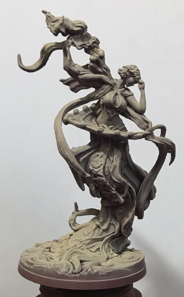
Gray zenithal
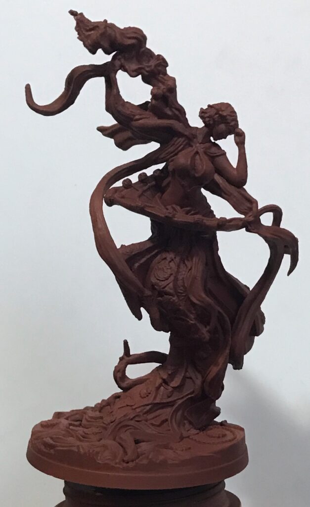
Here’s how it looks, step-by-step, for what I call “gray zenithal.” I used this when I knew the mini’s final color would be “cool”: green, blue, purple, violet, etc.
Tan zenithal
For “warm” or autumnal colors (yellow, red, brown) I used what I called “tan zenithal”:
Of course, I didn’t go through this process from start to finish with each mini one-by-one. I zenithaled them in batches:
Remember my “standard dwarves”? Here are the posts that contains examples of the dwarves with various washes and paints:
- Painting Miniature Figures
- Sundrop, tan zenithal, and contrast paints
- Contrast Paints and a Metal Dwarf
- Contrast Paints, a Golden Dwarf, and Contrast Medium
- Tainted Grail, the End of the Dwarves, Bugbear Warriors, and Colorshift
Or you can see them all once here:
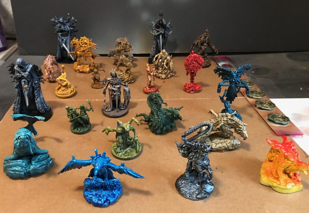
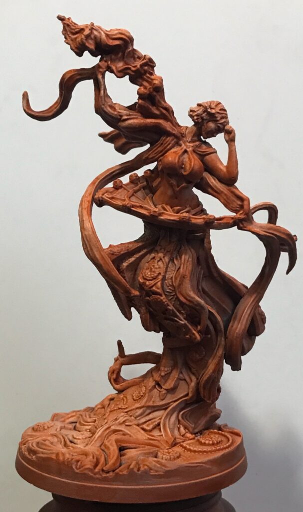
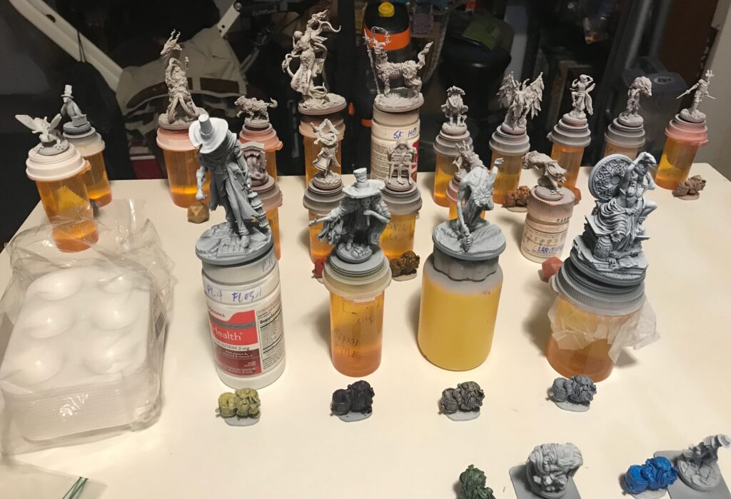
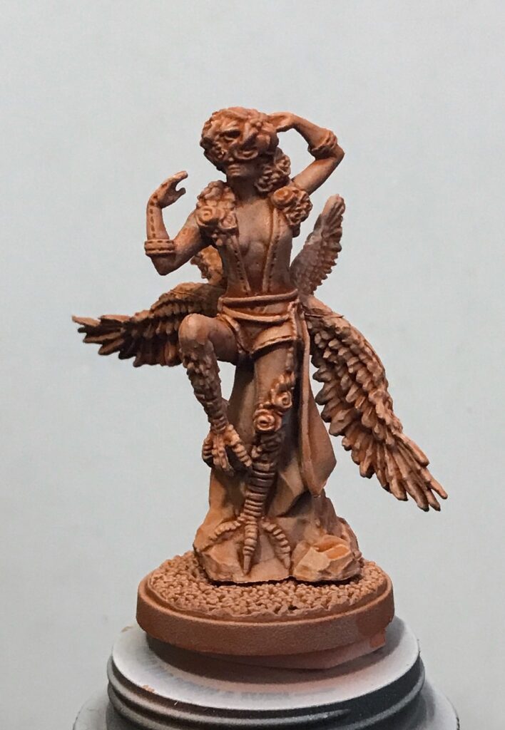
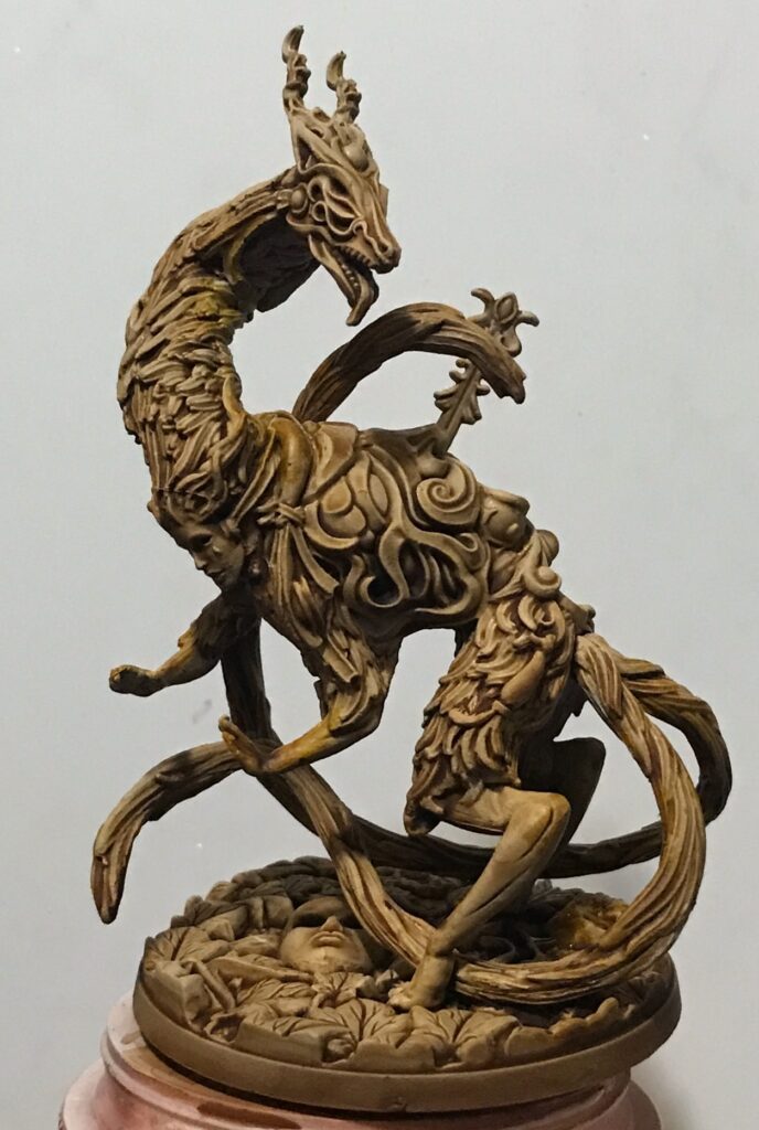
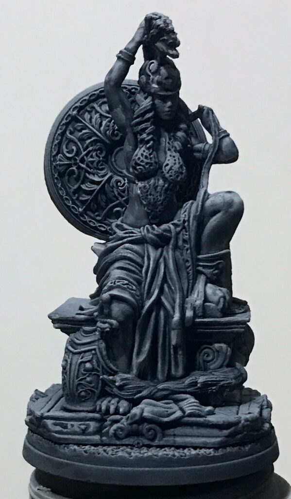
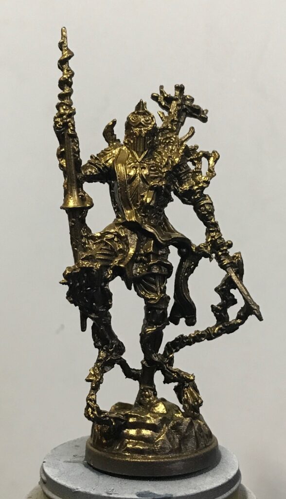
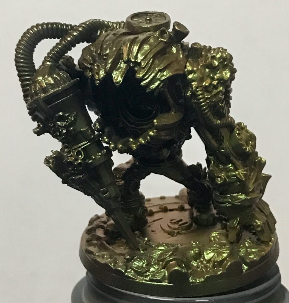
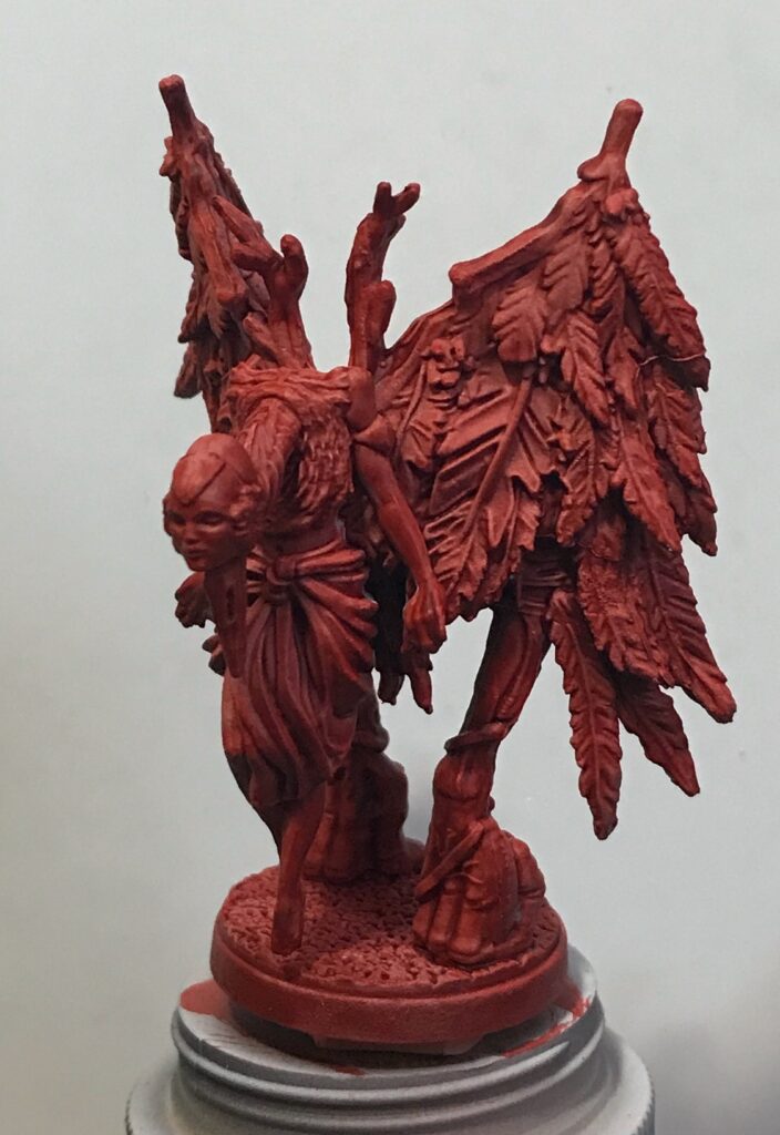
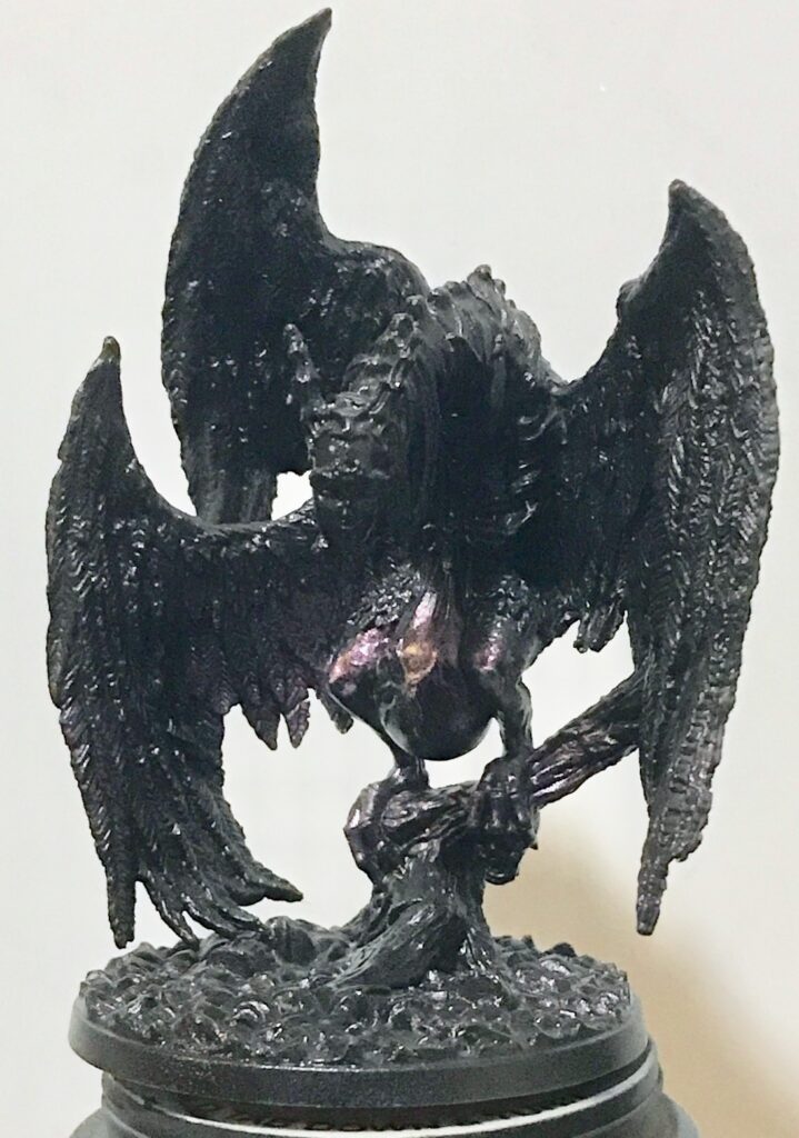
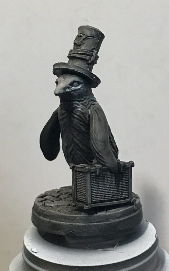
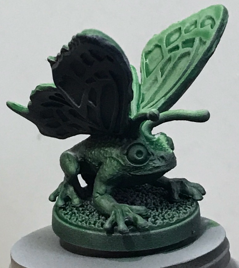
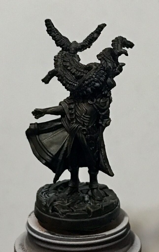
Results
I don’t show all the minis below, only the ones that are larger than the rest or that I think are particularly interesting.
The photos are sized to look impressive in the blog, so you won’t be able to judge the relative sizes of the minis. You may get a clue by the size of the pill-container caps, but I use containers of different sizes so that may not help. Don’t worry, (You were worried? Really?) there are photos of all the minis near the end of this post.
The final step
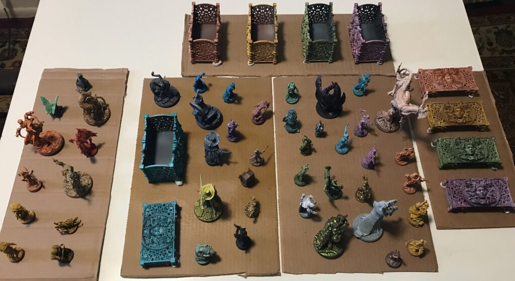
The last step in the miniature-figure-painting process is to apply a coat of varnish. Here are all the Etherfields minis attached to cardboard using poster tack, waiting for the spray varnish.
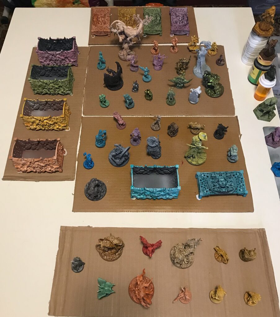
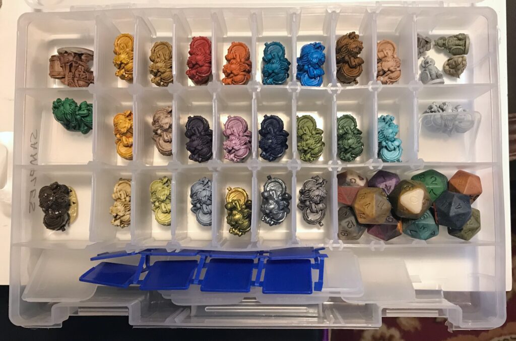
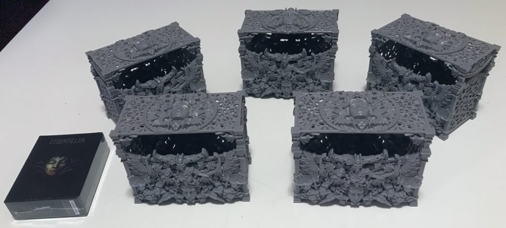
I briefly mentioned the card storage boxes above. Etherfields is, in part, a deck-building game: Each player gains new cards during the course of the campaign to improve their character’s abilities. The boxes were a Kickstarter extra to give each player a place to store their custom decks. This is what I received:
I decided to paint each player’s pieces (regular and Lucid, if you recall the pictures near the top of this post) and their storage box the same color. Here’s a different angle for the tableau of figures, so you can identify the figures whose colors match the boxes.
This looks great, except for one issue: I have to spray the varnish outdoors. Right now there’s several inches of snow outside my door. So it may be a while before the temperature is high enough and the humidity is low enough to finish this project.
What’s next on the painting schedule? Wave 2 of Tainted Grail, which should arrive sometime in the next couple of weeks.
My conscience demands that I mention that I get a tiny pittance if you click on the Amazon product links and purchase something through them.
Pingback: Making a holder for miniature figures – The Argothald Journal
Pingback: Etherfields Wave 2: Zenithal Prime and Contrast Paints – The Argothald Journal
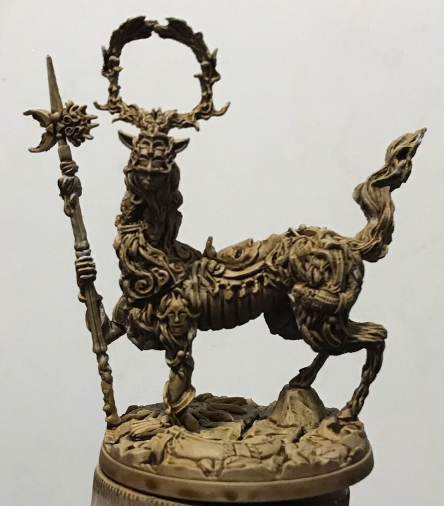
I really like the Two Tailed Fox with Seraphim Sepia. What was the base here?
It was the “tan zenithal” that I describe in the post: An overall spray of brown primer, a spray at 45° of tan primer, and a light dusting of white ink from directly above. Then I applied the Seraphim Sepia with a brush.