When I switched WordPress providers, many of the pictures did not import properly. You may want to view the old site’s post instead.
Tainted Grail
If you’ve been following the saga of my experiences painting miniature figures, you may remember that a big incentive was to paint the elaborate miniatures that I knew would come with the game Tainted Grail.
It finally arrived last month. As a game, it’s a great experience; in fact, as I type this, I hope to share it with other gamers tonight. As for the minis, there were 29 of them!
Here’s how my painting turned out:

For the most part, I stuck to the style I discussed a few posts back: zenithal prime, following by a coat of contrast paint. For a couple of them, I used washes instead. In foreground of the above photo, on the right, I experimented with a “fire” style: a zenithal with yellow overall, orange sprayed at 60°, and red sprayed from the top. It turned out well enough.
I should add that I did zero research before choosing the colors for the minis. I looked at the mini, thought about what colors might suit it, and mostly made each mini’s color unique. If I knew then what I know now about the game, I might have made different choices.
The Last of the Dwarf Brewers
I had a mild problem with my color choices: Most of the minis depicted variations on natural creatures, and I didn’t have quite enough distinct colors of contrast paints that suited their design. I partly made up for this by using washes, as I noted above. But it left me with the desire for just a couple more shades of contrast paints. My next big mini-painting project after this will probably be Etherfields, with even more minis than Tainted Frail.
So I ordered a couple more colors. That, of course, meant I needed more Dwarf Brewers minis to be test subjects.
It was then I noticed that these Dwarves were among the last available on Amazon. After this order, there might be no more. I’d ordered them all!
No, not really. I’m sure that Reaper made hundreds of them. They just weren’t available via Amazon at this time. But it also suggested to me that it might be time to switch to a different test mini.
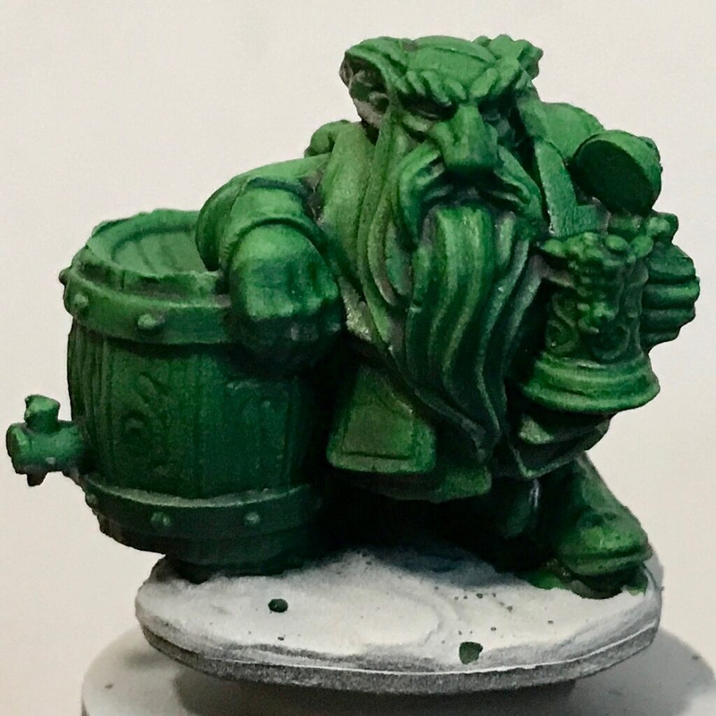
Before we get to that, let’s look at the last of the Dwarves:
Ork Flesh:
Darkoath Flesh:
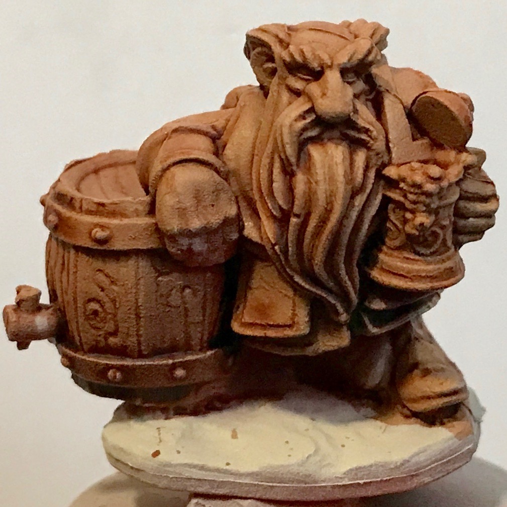
I feel these turned out nicely.
Introducing…
Who should replace the Dwarf Brewers as a test model? I needed something inexpensive, and sculpted with lots of crinkly bits so contrast paints, washes, and the like would show their effects. I settled on the Bugbear Warrior, also from Reaper:
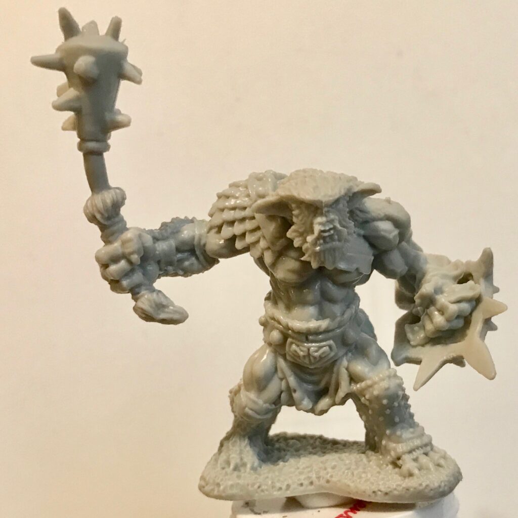
They are larger than the Dwarf Brewer mini, and I’m not sure how I’m going to store them long-term. (I keep the Dwarf Brewers samples in a Plano box.) But I felt I could deal with that later.
Colorshift Paints
The reason why I wanted to get more test minis is to test Vallejo Colorshift paints. These are a kind of metallic paint whose reflected color shifts depending on the angle you view it:

In retrospect, the Bugbear Warrior mini might not have been the best choice to test such paint. We’ll get to that later.
According to Vallejo’s instructions, a surface to be painted with colorshift paint should be primed with gloss black:
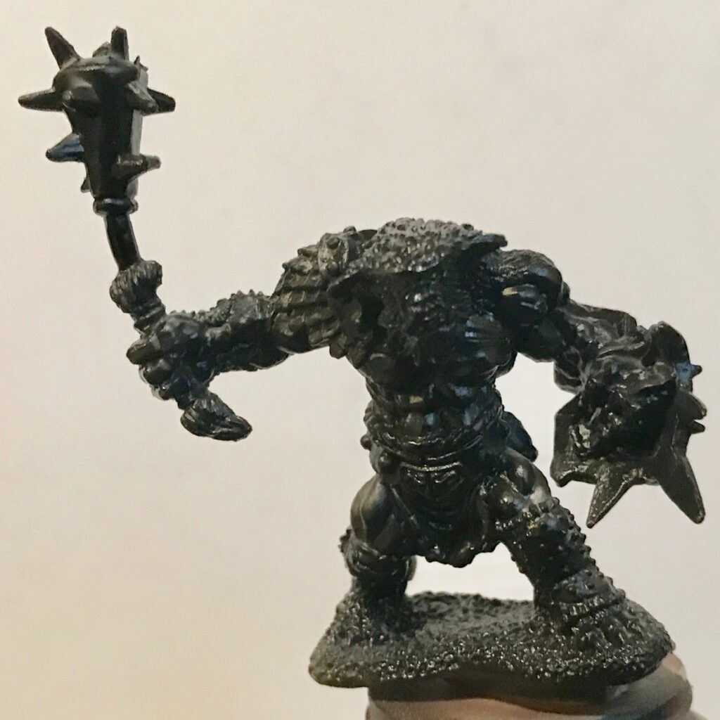
After that, the instructions recommended using an airbrush rather than brushing the paint on. This suited me, since if my brush control were any good I’d be doing more than slopping contrast paint on minis.
The Vallejo colorshift paints are the thinnest I’ve ever worked with. I’ve worked with Vellejo metallic paints before, and those were thick and required a lot of thinning to get them through the airbrush. The colorshift paints were so thin that they didn’t need any flow improver or thinner.
They were also the first paint with which I’ve worked that required multiple coats. In general, you’re supposed to apply paint (especially with an airbrush) in multiple thin coats. I’ve never bothered; I could also do what I wanted to do with a single coat of whatever paint I used. Not this time. The first time I used to the airbrush to apply the paint I saw so little difference on the surface of the mini that I thought my airbrush was broken.
In the end, I had to apply six or seven coats to each mini to finally eliminate all signs of the black gloss primer. It was both labor- and time-intensive.
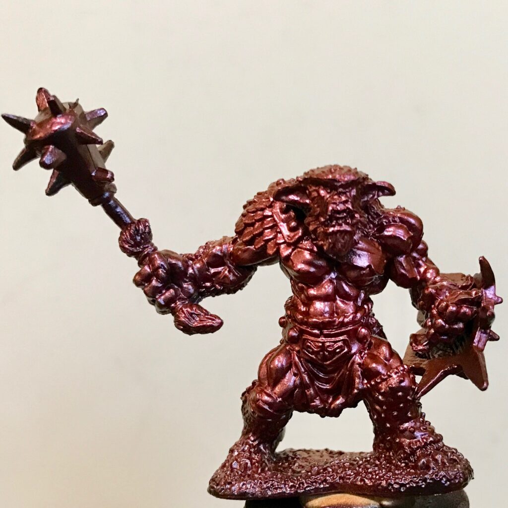
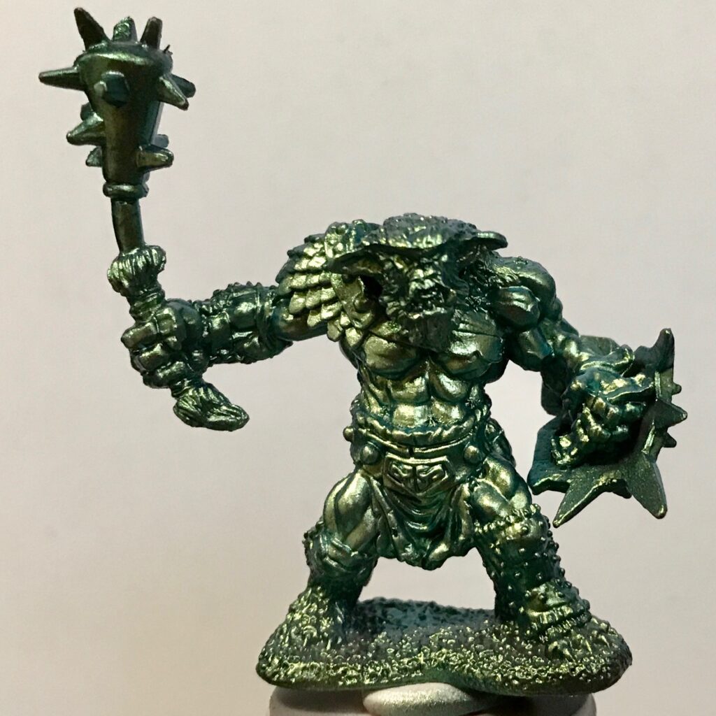
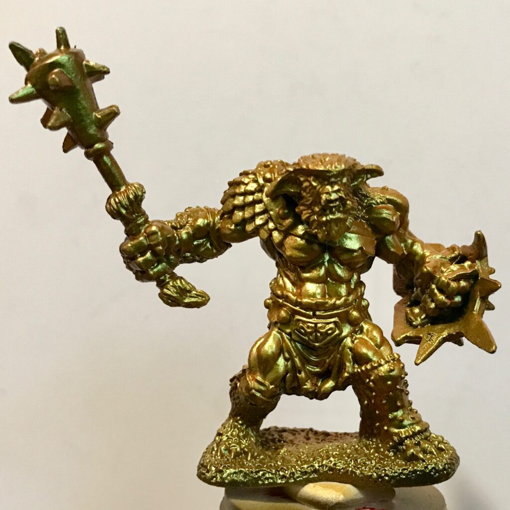
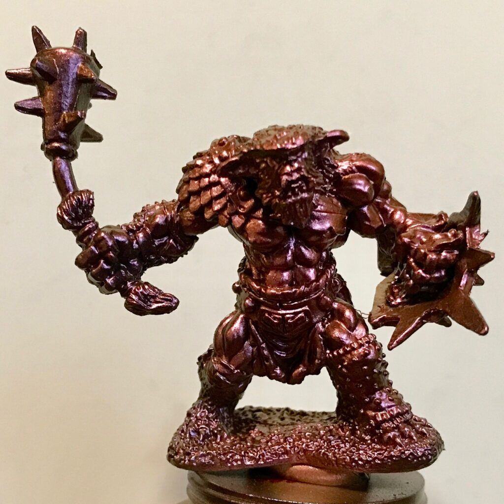
For all that work, I hoped for better results. The names of the paints are supposed to reflect (pardon the pun) the two colors between which the light is supposed to shift.
1) Pearl / Violet:
2) Gold / Pale Blue:
3) Gold Yellow / Burnt Orange
4) Silver / Pink
5) Old Silver / Pale Violet
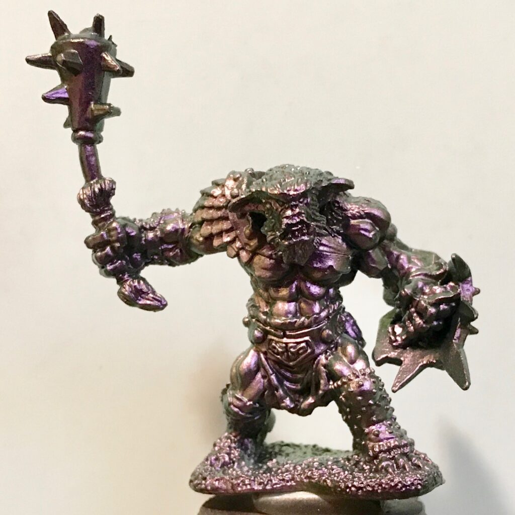
6) Violet / Old Copper
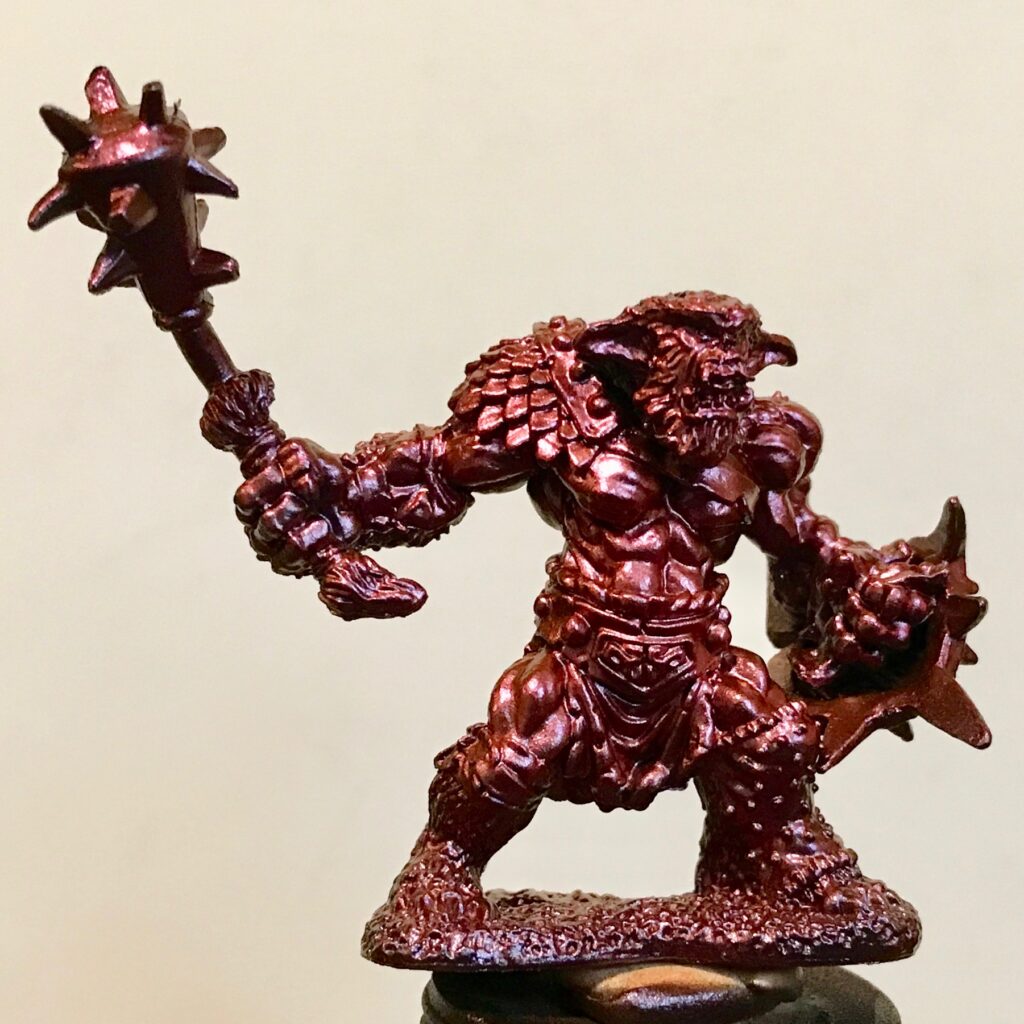
As I noted above, in retrospect perhaps I should have chosen minis with large curved surfaces (a big helmet? a smooth curved shield?) to test these paints. However, I’ll note that this particular set of paints is labeled “Magic Dust” by Vallejo, so it’s clearly being marketed for fantasy miniatures (as opposed to Galaxy Dust and Space Dust which appear to be for space marines and the like).
The colorshift effect is hard to see in static images. I tried to make a short movie to hopefully show what it looks like. This is from paint test #3 in the above list:
If you’re having trouble seeing the effect, so do I. In fact, the color-shifting is really only visible in #2, #3, and #4 in the above list, with #3 being the best.
On a side note, these are also the first paints I’ve worked with for which the color of the bottle has little to do with the color of the paint after it’s applied:

A frustrating aspect of working with these paints is that, as a test, I used a brush and smeared a bit of the paint on a piece of plasticard. The colorshift effect was clearly visible. It just wasn’t showing up on airbrushed crinkly minis.
The reason why I wanted to test the colorshift paints is that Etherfields is set in a dream world. I thought the eerie effect of shifting colors would be appropriate for sculptures that represented dream creatures. The resulting colors are different that what I would have gotten if I purchased the Vallejo Metallic Colors set, but were they worth the additional effort? Maybe #3, perhaps #2 and #4. The rest look like different shades of metallic purple.
I should acknowledge: I might have gotten better results if I’d been willing to apply a few more coats. I may have gotten better results if I brushed the paints on instead of spraying them. I may very well be using the paints for a purpose for which they’re not intended.
For now, I have to say that I don’t plan to use them in the future.
This is one of the most popular posts on this blog. Therefore, my conscience demands that I mention that I get a tiny pittance if you click on the Amazon product links and purchase something through them. I feel this is okay to do, because I have no soul.
Pingback: Etherfields Wave 2: Zenithal Prime and Contrast Paints – The Argothald Journal
Pingback: Vallejo shifters, space dwarves, and ISS Vanguard – The Argothald Journal
Pingback: A letter about 3D printing – The Argothald Journal
Pingback: Kings of Ruin: Cat pictures – The Argothald Journal