When I switched WordPress providers, many of the pictures did not import properly. You may want to view the old site’s post instead.
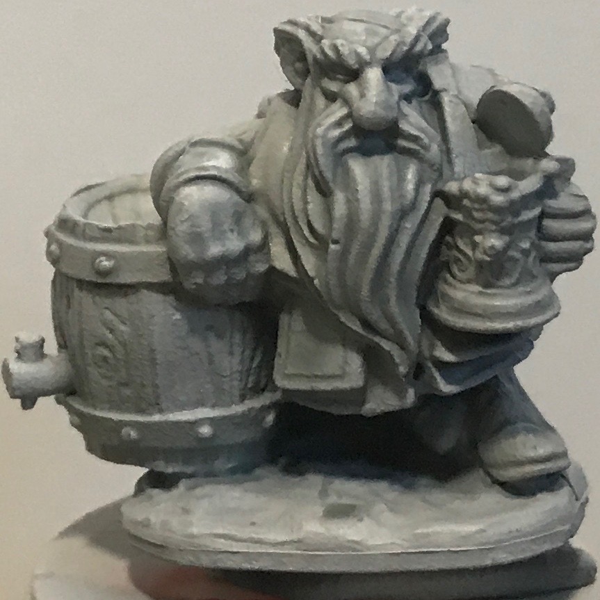
This post is a continuation of a previous post in which I compared some contrast paints on my favorite test miniature, the Dwarf Brewer.
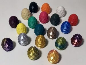
More contrast paint colors
In that post I separated the warm colors from the cool colors. I’ll continue to do that here, even though I’ve only got one autumnal color in this new comparison.
Warm colors
As a reminder, I apply my warm colors over a tan zenithal:

Here’s the autumnal contrast-painted mini:

Cool colors
The rest of my tests are over gray zenithal:


Observations
In my prior miniature-painting post, I said that my collection of contrast paints lacked lighter blues and purples. The last three paints listed above certainly satisfy that need. However, see my discussion of contrast medium below.
I didn’t expect much of an effect of Apothecary White over the gray zenithal. While the effect isn’t extraordinary, it is there. There are some spectral miniatures in both Tainted Grail and Etherfields, so I think I’ll find it useful.
The golden Dwarf
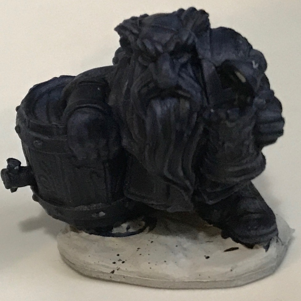
In that last post, I presented a Dwarf that I painted with a “silver zenithal.” I talked about doing this same thing with golden metallics. Here’s the result, using a base of Vallejo Tinny Tin, a 45° spray of Vallejo Bright Bronze, and a 0° spray of Vallejo Polished Gold:

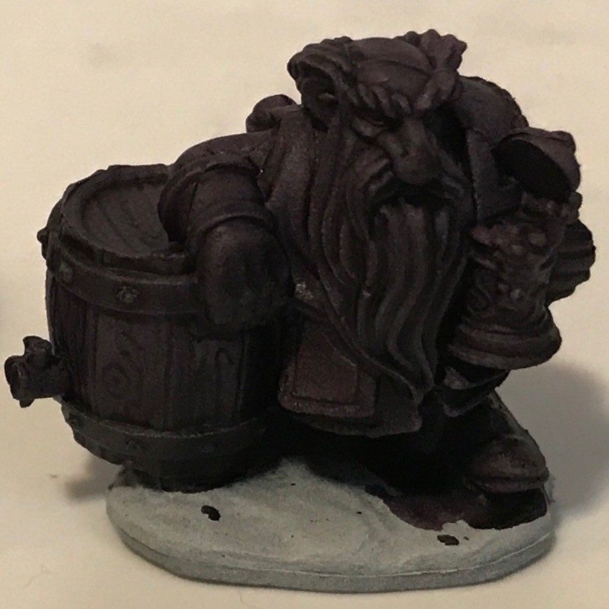
Here’s the silver Dwarf from that last post:

In the photos these two show about the same amount of contrast, but in person the golden Dwarf looks almost too reflective. I felt a need to tone it down. So I experimented with contrast medium.
Contrast medium
In painting, a “medium” is a color-neutral fluid you add to paint to change its characteristics in some way. Any acrylic paint can be thinned by adding water, but that might change the paint’s qualities: drying time, glossy vs. matte, viscosity, etc. For example, I frequently use both an airbrush thinner and a flow improver to help get my thick or metallic paints to spray smoothly through my airbrush. (For more on this topic, here are short and long explanations.)
That leads us to contrast medium. Mixing this with contrast paint will reduce the intensity of the color (since the pigment fragments will be farther apart) while leaving the flow characteristics unchanged. Here’s a video explanation of how it works.
As I looked at the golden Dwarf, I thought I’d try to use contrast medium to thin the color of one of my green contrast paints. I knew from the video that mixing medium and paint 1:1 would result in something like a wash or a glaze. My goal was to let the mixture flow over the gold and into the mini’s cracks and crevices, to give the effect of verdigris.
I chose to mix the medium with Creed Camo. Here’s the picture from my previous mini post of how that looks undiluted:

I mixed that shade with contrast medium in equal proportion, and brushed it over the golden Dwarf. I left the Dwarf’s barrel untouched so I could see the effect.

It wasn’t the result I expected, but I like what I got. It “aged” the gold in a way that made it look old copper or bronze. I might have achieved a similar effect with a green wash, but the green washes I’ve got have a brighter tone that I don’t think would have looked the same.
I could also use contrast medium to “lighten up” the very dark contrast paints I showed in my previous post. This is Leviadon Blue and Shyish Purple.
Mixing paint to medium in a 4:1 ratio would lighten these shades. I might test this effect eventually.
Now I’ve got a new technique in my “sloppy painting” toolbox. I’m now curious how it would look if I took the silver zenithal I show above and use a thinned contrast paint over that. If I used red, might it look rusty? If I used blue or purple, would it look like a magic aura?
At some point I may try and find out!
This is one of the most popular posts on this blog. Therefore, my conscious demands that I mention that I get a tiny pittance if you click on the Amazon product links and purchase something through them. I feel this is okay to do, because I have no soul.